Creating a Magazine

dscf0093

Recently I’ve had the desire to create something physical. Since photography is currently my main passion, some form of printed work was a natural solution. I’ve had a few large prints made, which were momentarily satisfying, but tended to end up in the closet with very little exposure. A book seemed like a better way of satisfying the need for a tangible result that was also shareable. However, after a bit of initial planning, it became apparent that I did not have any projects that were complete enough. Also a book seems like a rather final statement on its subject, and I wanted to avoid the corresponding pressure when selecting photos to include. I’m indecisive enough as it is. The relatively relaxed magazine format seemed like a good compromise. It offered the possibility of future volumes on the same topics, or multiple topics per issue when there was not enough content.

The following covers my experiences creating my first (self) publication.

The Content

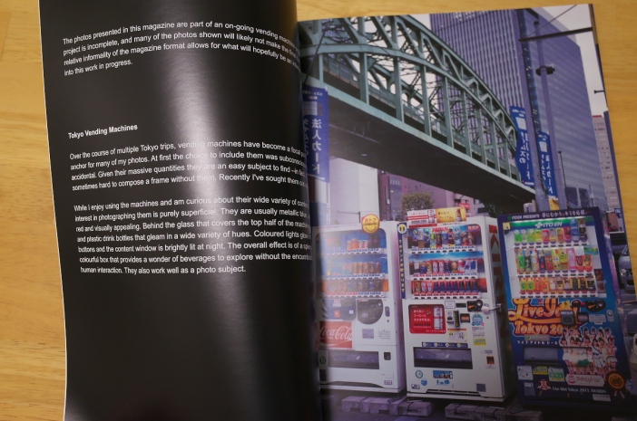
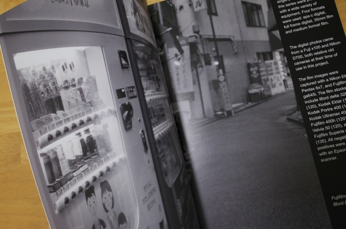
Since I’ve had the creation of a vending machine book in mind for a while, a magazine on that topic seemed like a natural place to start. While the photos I have are not as varied as I would have liked, there are enough of them.

The main problem was the text, which really was a problem of defining what the magazine was about. Although this was an issue featuring Japanese vending machine photos, was it really about the machines, or was it about the photos of the machines. I’m still not entirely sure which is the case and, embracing my perception of the looseness allowed in the magazine format, I ended up doing a bit of both, but not really much of either. The text ended up being along the lines of online photo gallery descriptions, and generally secondary. Often the words were simply driven by a need to visually vary the layout.

The Printer

I did not put a huge amount of effort into determining how to get the magazine printed. Getting bogged down in such matters for my first attempt at a publication might have caused it to never happen. I wanted to concentrate on the content but not so much on the final production and so I went straight to researching companies that would do it all for me. Decent quality and economic print runs at low volume were the main criteria.

The top Google searches pointed towards Blurb, an online on demand printer that could deliver full colour bound books in a variety of formats. I intended to distribute the copies myself but they also offered a marketplace for selling books printed through them, which was a nice option to have. There are several other companies with similar offerings but I really didn’t spend much time researching them. Blurb seemed to be the most reviewed for photo books with reasonable ratings for quality. The prices for their magazine format was okay. Initially the prices seemed great, but shipping is expensive. Apparently shipping costs vary depending on the country and how far away the printer is. Be sure to price shipping before committing to blurb.

The Layout

Another attraction for Blurb is that they offer their own layout software. They also have templates for Adobe Indesign, which I don’t have. The software is really basic. My first reaction was disappointment. I missed such simple elements as coloured text backgrounds and transparency. But upon reflection I decided to embrace the simplicity and was happy to limit my options. The combinations are still practically infinite, and not having design experience it’s probably best that I had fewer tools with which to complicate the layout.

I’m not sure if it was a limitation of the software or Blurb’s magazine format, but I could not find a way to print on the spine. Even with my thin, 36 page magazine, I would have liked to have at least printed a small issue number.

I really didn’t know where to begin and so started with the cover. I figured it was probably wise to put a disproportionate amount of effort into this and worked through a few versions.

For the interior I simply started throwing photos onto pages in varied layouts and then added bits of text that occurred to me at the time, mostly to fill space and balance layouts. Besides adding a bit of interest, the text might also provide some pacing, slowing people down so they don’t breeze through the photos to quickly.

R0000141.jpg

The Result

Before placing the final order I had a single proof copy printed. At $12 Canadian, the cost of shipping a single magazine was a bit ridiculous, but the package arrived promptly and was well protected. The magazine was 36 pages plus cover and cost $10 to print, so the total price of the proof copy, including taxes was just over $23.

The results were better than expected. Layout wise, everything matched what I had seen on screen. I’d heard horror stories about gross misalignments. I suspect such cases occurred when neither Blurb’s software nor InDesign templates were used. Colour and brightness wise the results were good. Only the cover hue was slightly shifted, which was made obvious by the cover’s image being replicated inside where it was better.

The length also made for a decent enough heft. I’d worried it would be too thin, but it felt reasonably substantial.

After reviewing the proof, I corrected a couple of typos and left the cover as is. The cover still looked good and it did not seem worth trying to counteract the hue shift since that would have involved at least one more proof copy.

I decided on an order of 20 copies, which gave me a 20% per issue price break. Thankfully the shipping cost per copy also came down substantially. In the end, including shipping and taxes, each issue cost $12.

The order arrived without fuss. Twenty copies, all individually sealed, in a well packed box. The interior looked identical to the proof, but the cover’s hue was off more than the first copy, although it is hardly noticeable and doesn’t bother me. Overall I’m happy with the result and eager to share the final product.

R0000139.jpg

  Conclusion

At this point I definitely intend to create another issue although I may do things a bit differently. I probably won’t alter the technical aspects of the production –sticking with blurb and their software– and continue to concentrate on the content. I feel more significant text would be an improvement. To that end I may consider using articles from this blog, perhaps remixing or extending them.

The process of creating the magazine was highly enjoyable. It also satisfied my desire for a balance between the finality of a book and ethereality of online photo galleries. Even if the process had not been enjoyable, having something tangible to hold in my hand and share with friends, family and fellow enthusiasts more than justified the effort.

I highly recommend that others try producing a photobook, or at least make some individual prints. Making photos a part of something larger than themselves gives them an extra layer of purpose and the scrutiny involved in the selection process can give new insights into one’s work. At the very least, the production of a physical object seems to satisfy a basic need that is all too starved in this world of virtual products.

Revisiting a Composition

When photographing static, relatively unchanging subjects, such as landscapes or architecture, there is an opportunity to revisit a scene under different conditions. Landscape photographers in particular tend to do this, sometimes retrying the same composition year after year. Each time they get a better sense of how the light changes with time of day and season and increase their odds of getting better weather and a more appealing sky.

The strategy can apply to photography in cities, or anywhere that is relatively static and lit by the sun.

Shinjuku Intersection

DSC_7481Shot with the d700 and Nikon 75-150 3.5e around 4:30pm. The shadows from the buildings behind are already creeping over the scene.

There are a few compositions I’ve revisited from time to time. One of these is a scene in Shinjuku that I initially figured out using google earth. I later found out that it’s actually a fairly famous view point. After my first visit I was excited enough by the freshness of the discovery to make plans to return. Not only did I want to find better conditions, but I also wanted to try different equipment. After several attempts over multiple years I’ve shot the scene with digital, and medium format Superia 400 and 400h.

Pic0048 Photographed with the Pentax 6×7 on Fuji Superia 400 during a spring afternoon. From the length of the shadows it appears this was taken earlier than the d700 photo.

I’m sure there’s a better shot to be had and intend to make more attempts in the future. On the Pentax 6×7 my 200mm isn’t quite tight enough so I’d like to take the photo with a 300mm lens, but I’m not prepared to buy one just for this shot. Even if I owned the 300 I would be reluctant to lug one of those anchors to Japan. Perhaps I’ll someday find a way to rent or borrow one in Tokyo.

Pic0049bPentax 6×7 with 400h in the autumn. Some clouds and the 400h made for a lower contrast image.

While I’d like to check the scene during sunrise or sunset, I haven’t made it a priority because it seems unlikely that a decent image is possible during those times. For this scene the sun will set behind the photographer, which initially seems promising for a capturable tonal range; however, there are also very tall buildings behind the photographer, casting shadows over the scene. So, when the sun is low enough to set and light up the sky, the shadows are long enough to put the street in shadow. Perhaps this might change a bit by season, so it’s still worth revisiting to see if some shaft of light manages to slip through the buildings to light up the intersection. Sunrise will mean shooting into the sun and will almost certainly be worse contrast wise.

I look forward to seeing what conditions await during my next visit.

50mm

DSC_9635 Taken with the classic and economical Nikon 50mm 1.8.

I prefer to shoot with primes. Not only because they are usually brighter, lighter, and of higher quality than zooms, but also because of the creative constraint. For these reasons I use primes almost 90% of the time, and of those primes a 50mm (or equivalent), is preferred.

Traditionally the most common focal length favorites are 50mm, 35mm, and 28mm. Anecdotally, 35mm seems to be the most common preference these days and, due to cell phones, it is probably the most used by default.

Evidence of what is currently popular in focal lengths can be found in the available non-zoom fixed-lens camera offerings. Those with wider fixed focal lengths are currently relatively easy to find. There’s the Fuji x100 and Sony rx1 for 35mm and Ricoh GR and Fuji x70 for 28mm. The only modern fixed focal length cameras I know of are odd and obscure Sigmas. In the days of film, 50mm was the most commonly found focal length. There were large numbers of cameras available with fixed fast 50 lenses. The Yashica Electro 35, Canonet ql19, Fujica 35ee, Konica Pearl, and Yashica Mat are just some of the film cameras that I personally own that have close to 50mm focal lengths or their medium format equivalent.

Pic0025Taken with the almost-50mm 45mm of the Canonet ql19

Apparently one of the reasons 50mm was more common in the past was because it was difficult to create quality wide angle lenses, and so photographers simply became used to what was available. As production processes improved, this became less of an issue, and so perhaps convenience and ‘true’ preference are now the driving criteria. The common argument for 35mm is that it is the most versatile: wide enough to fit most subjects in frame without the distortion of the wider focal lengths. It also still allows some subject isolation, especially in full-frame format or larger. 28mm captures even more in frame but distortion starts to creep in, and subject isolation is more difficult.

My Preference

Despite owning an x100 and ga645i for a while, I still find 35mm a bit boring. Usually people accuse 50mm of being the most bland. I’m not sure if many agree with me, but my order of focal length preference starts with 50mm and ends with 35mm, with 28mm in the middle.

DSC_9014 With 50mm on “full-frame”, it’s easy to create thin depth of field.

DSC_9147 Even at a distance, and stopped down to 3.5, it’s still possible to create focus based depth.

For me 50mm can have more depth due to increased area of focus control while 28mm does this through its more extreme perspective (i.e. one needs to get relatively close with 28, and the background is pushed away). I feel 35’s lack of sufficient depth of field control and perspective warping leads to flatter images.

Also, I like the slight perspective compression available with 50mm. It’s hard to say exactly why, it’s simply the way I currently prefer to distort reality.

Sometimes I do find 50mm too tight, particularly in crowded cities like Tokyo where there might not be room to step back. However this may be beneficial along the lines of the sentiment expressed in Robert Capa’s famous quote: “If your photos aren’t good enough you’re not close enough”. Photos taken with longer focal lengths tend to be simpler with more isolated subjects simply because it’s usually easier to walk forward than back and easiest of all to stay put.

DSC_9651 50mm maintains low distortion and encourages simpler composition.

Recently I picked up a Ricoh GR and so look forward to exploring the 28mm focal length. Perhaps it will become a favorite. At the very least, switching focal lengths from time to time is a good way to gain fresh perspective on one’s composition.

Jpeg Experiment Follow up

This is a follow up to the Jpeg Experiment entry. As planned, I put aside the film camera and took up the x100 in jpeg only mode for a while.
DSCF0118

The intention was to force myself to be more aware of my settings and to “get it right in camera” by removing the safety net of raw. Towards this end the experiment was a success. I also found myself taking and discarding more photos of each subject, fine tuning the output. Such a process doesn’t lend itself to candid shots of quick moving subjects but worked well for the static scenes that make up the majority of my photography.

DSCF0135

During a photo-walk with a friend, just as the sun was setting, we stumbled upon a mostly hidden courtyard on the University of Alberta campus. Regardless of whether the photo is successful or not, I achieved the effect I had hoped for by bringing the exposure down to keep the sky and emphasize the yellow of the light.

DSCF0136

At one end of the courtyard was a yellow painted trashcan and a yellow light, and at the other was a red chair and red interior light.

DSCF0147

It was so perfect, almost as if someone had deliberately set the scene. Although I took several photos, and it was hard to choose amongst them, I wish I’d taken more!

DSCF0152

Overall the experiment had the desired effect: it kept me more alert to exposure and colour than I usually am when shooting digital. I will still mainly shoot raw, but think it is beneficial to return to jpeg-only from time to time, particularly if my discipline begins to wane.

Also, I plan to continue to select colour modes while shooting raw. Although these settings will be lost in post, they aid with visualization and enforce more precise intention while shooting.

For those that only shoot digital-raw, I’d recommend giving jpeg a try for the reasons mentioned, and for those that shoot film, I’d still suggest trying it out from time to time due to the benefit of immediate feedback.


Jpeg Experiment

Whenever I shoot with a digital camera, which is not all that often compared to film, I always shoot raw files. The advantages of this are obvious and well documented, but lately I’ve been thinking of reasons to shoot jpeg that extend beyond convenience.

The idea started when I began fiddling around with my (first generation) Fuji X100 after a long break. I never quite took to the camera as I’d hoped. The main reason I bought it was to have a small, light aps-c camera that was easier to lug around than my D700. I also didn’t want it to be a system camera since that always leads to more equipment and bulk and complications. I like the camera but did not use it as much as intended for a few reasons. It’s operation was slow compared to a dslr (although much improved with the latest firmware), it wasn’t my ideal focal length (I really wish there was a compact, large-sensored, fixed lens camera with a fast 50mm equivalent available), and I could not get the results from the raw files that the jpegs proved were possible.


Provia and Velvia

Astia and Monochrome

Contemplating the X100’s beautiful jpegs got me thinking about some of the format’s other advantages.

Two things I love about shooting film are the look and the discipline it enforces. The Fuji’s film simulation modes go part way towards the aesthetics aspect but it was really the later idea that caught my interest. Each film type has a unique look and some are more distinct than others. Black and white film is an obvious example, but Velvia is similarly specialized. Once a roll is loaded, optimal options are limited and one is forced to look for situations that best take advantage of the emulsion. This pushes the photographer to find shots beyond the obvious. Since jpeg modes can be changed on the fly, the discipline isn’t quite the same as with film, and yet, I think some of it remains because one still has to consciously think about what simulation to use rather than mindlessly shooting with the knowledge that everything can be fixed in post.

The other discipline is to get the exposure right in camera. Raw allows a lot of post processing leeway. But, even with raw, it is almost always best if the exposure is correct to begin with. Not doing so may also indicate one is not really visualizing the desired outcome. Of course the discipline isn’t quite as extreme as with film since there is always the possibility of instant review. But it still promotes exposure mindfulness.

I could also do the same thing with the D700, especially by setting up “strong” presets for different looks, and I imagine such options are available for most cameras.

Conclusion

Of course one could go partway by simultaneously shooting both raw and jpeg. On the surface this seems ideal as it allows one to tune photos towards a specific aesthetic while maintaining a safety net. And maybe others are disciplined enough to make this work, but for me, I think the knowledge of having the raw file would detract from my focus on getting it exactly right.

I’ll likely still use raw when the stakes are high, such as on an overseas trip or in the rare cases I’m covering an event. But, as a learning exercise, I plan to do jpeg only shooting around my hometown for a while.

Quest for the Perfect Film Travel Camera

dscf0400

When I first caught the photography bug I traveled with as much gear as possible. The weight was mildly annoying but not something I gave much thought. Neither was the idea that limitations can spawn creativity. Now that I’m older, and have accumulated some experience, and, even more relevant, various aches and pains, my equipment priorities have changed somewhat. My back and legs will no longer let me carry everything that will fit in a bag.

At the moment, shooting film is my priority, so this article will focus on my quest for the ideal film camera for travel.


Criteria

Quality, flexibility, and weight are the competing criteria that need to be balanced.

While I enjoy shooting 35mm film, and my Nikon EM is certainly small and light, if I were to be restricted to only one camera, quality would demand that it be medium format. This restriction eliminates the majority of possibilities. While the larger configurations are preferable, 645 is acceptable, and has the added advantage of requiring fewer roll changes.

A light system that offers multiple focal lengths may be ideal, but I’m also quite comfortable with a single fixed lens. If only one focal length is possible, a 50mm equivalent would be my choice. While I have a couple of external light meters, I much prefer the convenience of a built in one when traveling.

It’s hard to set a fixed upper weight limit, but any system that totaled under 1kg would be acceptable.


Findings

The first medium format camera I traveled with was the Fuji GW690ii. While it offers my favorite focal length (90mm, slightly wider than 50mm equivalent in 35mm terms), and is fantastic quality wise –the best I’ve used– it was large, needed an external meter, and required film changes every 8 frames. Despite these restrictions, I may have traveled with it more if it didn’t break.

Next came a Pentax 6×7 with various lenses. This was definitely not light but offered great quality and flexibility. It is still my main camera but prompted me to quest for lighter alternatives for travel.

Folders seem like a great solution to the size and weight issue. The Fuji gf670 has a desirable focal length and a large negative but was too expensive and is not as light as it looks. My first folder was an Adox Golf. It’s 6×6, sort-of pocket-able, and only $5. On the other hand its viewfinder is small and vague, the lens isn’t sharp, it has no meter, and, being without a range-finder, requires “guess focusing”. I’ve never considered traveling with it.

Pic0008Image from the Konica Pearl 2

Similar in size and weight to the Adox is the Konica Pearl 2. Although more expensive at about $125, it is a vast improvement. There is a range-finder and the lens is quite sharp (although prone to flair). It doesn’t have a light meter but it’s main problem is the vagueness of the viewfinder (especially with glasses) and the difficulty in loading film. I don’t know if something is wrong with my copy of the camera, but changing rolls is nearly impossible, even when attempted in comfortable surroundings, let alone on a crowded street. 

dsc_8414 Konica Pearl 2

At this point I began considering more expensive options. Mamiya 6/7s were still too much, and not particularly light. But Fuji had some interesting and unique options. I was initially attracted to the gs645 because of it’s 75mm 3.5 lens (close to a 50mm equivalent and my bias). Being an older camera it is also less expensive, and being a folder it is compact. But having had a couple of old folders I’d become wary of their fragility. The stakes are too high when traveling to far off locations to risk using old brittle equipment.

The next iterations in the series, the gs645s and ga645, do away with the bellows and, apart from their focal length, seemed ideal. Unfortunately the 60mm f4 lens only gives a roughly 37mm equivalent in 35mm terms. I hesitated for quite some time but just couldn’t find an acceptable alternative, except for perhaps the Bronica rf645. But the Bronicas are rare, more expensive, nearly impossible to get fixed, and the 65mm lens isn’t much closer to being a 50mm equivalent.

Still not entirely decided I began looking for the Fujis in Tokyo camera stores during a visit in 2015. They were not as prevalent as I’d recalled seeing in the past. I found one gs645s for a good price but found the range-finder to be broken. Having been so close to buying the camera, and having the opportunity pulled away at the last moment, helped motivate me to jump at the purchase of a ga645i when I found a clean (but at 600$Can, not cheap) copy in Shinjuku.


Fuji ga645i

The ga645i was fully put to the test during another three week Japan trip in the spring of 2016. For the trip I left the Pentax 6×7 behind and, although I also brought a Nikon D700 and EM, I only ventured out with one camera at a time, and a majority of those days that was the 645.

I’ll leave a full review of the ga645i for another post but here is a brief overview of my findings.

I’m completely happy with the camera’s size and weight. It’s lens retracts when not in use making it very packable and it weighs less than my D700 with a small prime. The auto-focus and accurate meter is nice for catching quick, candid shots. It’s the easiest of my medium format cameras to load and the lens is sharp and contrasty.

There are a few downsides. Not being an slr makes it difficult to use polarizers or graduated filters or to confirm focus. One has to keep an eye on the distance reading to help make sure the camera is focusing where intended. At f4 the lens is a bit dim and cannot produce the focus separation I’d become used to the on 6×7. Although hand holdable down to 1/30 or even 1/15 with a decent hit rate, I often find myself running out of light.

Despite these shortcomings, I would be nearly entirely satisfied if the focal length was extended to 80mm.

Pic0032Photo taken in Shinbashi, Tokyo using the Fuji ga645i


Conclusion

This is a never ending quest. Even if I had a camera that covered all of the criteria I can think of, preferences change with time. But for the moment, I’m content to make the ga645i my main travel camera.

Fuji GW690II

dsc_9905

This entry starts out on a sad note. My GW690II, although great cosmetically, is broken. And the parts to fix it are no longer available, at least not in North America. Fujifilm Canada redirected me to Fujifilm USA and they revealed that NO parts are available for it, or for any of its variations, or for any Fuji professional film camera besides limited components for the GF670 and GX680. It’s something to keep in mind when thinking of purchasing one of these cameras.

In my case the camera’s aperture is stuck at F32, so I don’t use it anymore. I hope to get another one, either entirely functional, or at least with the right working parts to steal.

However, besides the lack of support for the camera, there are good reasons to pick one up. But first, a brief overview.

Idle Food Cart


Models

As the II in the name suggests, this is the second iteration of the GW690 camera. There is also a III. In addition, Fuji released a GW670II, GW670III and GW680III, which were identical to their version counterparts except for the size of negative they produced, which is 6×7, 6×7, and 6×8 respectively, as the camera names suggest. The GW690s has a 6×9 negative. On top of all that there was a GSW690II, GSW690III, and GSW690III which all had a wider 65mm F5.6 lens compared to the 90mm F3.5 lens on the GWs.

Besides the frame size and the dual lens variations, the features of all of the models are essentially the same.


dsc_9904

Features

The GW690II is a simple camera with a short feature list. It has a fixed 90mm lens that projects onto a 6x9cm frame, producing a field of view roughly equivalent to a 43mm in 35mm terms. It can use 120 or 220 film for 8 or 16 shots respectively. The lens has apertures from 3.5 to 32 and a leaf shutter with speeds from 1 to 1/500 along with a T mode for longer exposures. Focusing is manual via a rangefinder and there is no light meter.

There is a cable release thread in the top shutter button and an additional shutter button on the front of the camera. There is also a shutter lock, hot-shoe, flash-sync port and tripod thread.

The camera doesn’t use batteries.


Negatives

I love this camera. It is/was one of my favourites. But there are some downsides.

Although the camera has a leaf shutter, taking a shot produces a substantial and ugly twang. This doesn’t seem to introduce any noticeable vibration but it does call attention to itself. Not that the GW690 is at all stealthy. It is surprisingly large. Surprising because it has the proportions of a typical 35mm rangefinder and so can appear deceptively small in photographs. In person it is comically large, living up to its nickname “Texas Leica”. So it is a substantial camera to lug around.

Another downside is it’s lack of a light meter. This isn’t a huge deal, and I will contradict myself in the next section by praising the camera’s simplicity and battery-less operation, but it would be a convenience for those of us that don’t have a meter in our head. I usually mount a small sekonic L-208 on top when shooting casually or carry a sekonic L-758DR for delicate work.

The minimum focus distance is one meter, which doesn’t allow for head shots that fill the frame. The GW is still decent for portraits but one will be restricted to chest up shots and wider.

For me, the biggest fault of the GW690 is the absence of a bulb mode. The T mode allows for arbitrarily long exposures but is terminated by advancing the frame. Even on a sturdy tripod it is difficult to avoid camera shake when pulling the frame advance lever. I’ve heard of people resorting to using a hat as the shutter, throwing it over the lens at the end of an exposure before pulling the lever. I think more than anything, the inclusion of a bulb mode would extend the appeal of the camera to a wider range of users, particularly landscape photographers.


Positives

Now for the good stuff.

I love this camera’s simplicity. There is no battery to worry about and all settings are made with mechanical controls. The simplicity also contributes to a nice clean design, which is unfortunately deviated from in the III.

Pic0002

By far the main reason to love this camera is the image quality. The lens performance is stellar and the negatives are about as large as you will get with roll film outside of specialty panoramic cameras. Not only is the lens sharp but it also has great colour, flare resistance and contrast and has very little light falloff, particularly considering the large area it has to project over. For some, the main downside of the lens is that the bokeh is a bit harsh, but even that is not always a negative. Some might also find the lens too contrasty, but I really like the look and find it’s relatively easy to find low contrast options amongst older, less expensive cameras.

sf2


Conclusion

For image quality, this camera is my favourite. Of course different circumstances call for different image quality characteristics, but, when an image is possible to capture within the camera’s limitations, it is my first choice of any other that I own, film or digital. Or it would be, if it wasn’t broken.
Pict0003

Setting the Bar

Pic0016 Pic0022
Pic0015 Pic0024

Culling photos is one of the photographic steps that I struggle with the most. This has become harder over time as my quality level has evened out. I take fewer terrible photos but rarely any that stand out. I often feel my output has risen to a level of uniform blandness. As a result, if I set the bar too low, I’m left with too many photos. If I set it slightly higher, I’m left with none.

Determining the quality of a photo, or any artwork, is a slippery endevour. What follows are some random thoughts on some of the factors involved.


Competing Criteria

It can be difficult to differentiate between the quality inherent in a photograph and the experience of taking it. A photo that was difficult to take, perhaps due to exceptional effort or bravery, will automatically seem more valuable to us, but any other observer will be oblivious to this effort. Our mood at the time of shutter release can also play a roll. This mood may have nothing to do with the photography experience itself. It might come from the day’s company, or the meal we just ate, or the weather. While a great mood might increase the odds of taking better photos, it is far from inevitable, and the association between mood and photo can be hard to separate.

The recommended solution is to wait a long time between taking and editing a photo. With time, the memory of the shooting experience fades. Because I shoot a lot of film, there is always some delay. This probably helps but I have trouble extending the wait much beyond the few weeks that finishing a roll and development and scanning usually take. This is because I feel burdened by a backlog and lose my desire to add to the pile which discourages me from taking more photos. This is a miserable state to be in, so I try to get through the process as quickly as the film process allows.

Pic_0006

Shot from the U of A campus where I went to school. The brutalist architecture is very nostalgic for me, which is enough reason for me to enjoy the photo.

Major Photography Trips

Self editing is especially hard when going through the inevitable pile produced while away on vacation. Such trips are inherently ‘special’ and result in large quantities of photographs that are charged with memorable experience. It’s difficult to cull mediocre ‘I was there’ photos when a place may never be visited again.

New surroundings also turn one’s attention to the mundane. This is not inherently bad. The slight differences in everyday objects can make them interesting subject matter to non-locals. Ideally the photos should be strong enough to be interesting to everyone, regardless of their familiarity with the content, but a potential audience of “everyone outside of a particular country” isn’t so bad.


Pic0021

Is a plain, straight-on, centered view of a Tokyo vending machine of interest to anyone outside of Japan (or anyone that’s not me?)

Familiar Subjects

On the other end of the spectrum is photographing the environment we live in –the familiar. Creating an interesting photo out of a boring object is much harder than with an exotic one. In addition, new photos are compared against the much larger body of work that inevitably results from readily accessible subject matter.

Because of these difficulties such environments can be the most valuable to practice in. They force us to see differently and to better understand what we like in a composition. But they can also sap inspiration. Ideally I’d like to be able to apply the objectiveness learned from photographing my neighborhood to the photos from my travels.
Pic0001

Sometimes small details can liven up mundane, overly familiar areas

Inconsistency

Currently I’ve embraced some inconsistency in my output. I’ll allow a photo to carry more weight due to my personal relationship with the subject matter or circumstances. I’m not entirely happy with this method, or I probably would not be writing this, but the result is a gallery of photos that is a bit more interested for me personally.


Conclusion

In the end the results are all subjective. Of course there is nothing wrong with taking and enjoying one’s photos even if their only merit is a reminder of the experience of taking them. And ultimately we should focus on making photos we enjoy without worrying about the opinion of others. Besides, regardless of how odd our tastes are, they aren’t so unique that there isn’t a likewise minded audience somewhere. However, if one is attempting to build a reputation with others, it is perhaps helpful to keep one’s biases in mind.


Shooting Film in Tokyo

For my trip to Japan in the fall of 2015 I was more determined than ever to shoot film. To this end I brought the petite Nikon EM and the travel inconvenient Pentax 6×7 with the additionally inconvenient 55mm F4, 105mm F2.4 and 200mm F4.

To circumvent airport security scan worries, I decided to have all of my film developed in Tokyo. I cannot comment on how difficult the procedure is for non-Japanese speakers since I had the help of fluent friends, but I suspect it is bungle-able if no special processing is required.

For geographic convenience all of the film was dropped off at the Bic Camera in Shinjuku. Bic Camera is a chain with many locations throughout Japan and they offer the options of developing the film in-house or sending it to Horiuchi Color professional film lab. Given the minimal price difference between the two I opted for the latter. I didn’t inquire about all supported film formats but they readily accepted 35mm and 120mm colour negative, positive, and black and white for processing. Surprisingly black and white film took less time to process than colour negative film and reversal film was even faster with the development times being 3, 2, and 1 days respectively. It is pretty much the opposite of here in Edmonton, Canada and at about $5 per roll, it was also cheaper.

Provia 400x

On a whim I picked up a roll of Provia 400x reversal film, which I had never shot before. Up until that point I had only seen reversal film sold in five packs and I didn’t want to commit to so many rolls given the latitude restrictions and my experiences of high developing times and costs in Canada. But Kitamura Camera in Ikebukaro had a few individual rolls for sale so I picked one up and shot it in Shinjuku with the Pentax 6×7.

Pic0010

As always seems to be the case with positive film, the results were seductive, but what was particularly surprising was the quality despite the relatively high speed of 400. The amazingness of 400 speed reversal film started to seep in and I was suddenly eager to shoot more. Bic didn’t have it, and neither did the Shinjuku film sub-store of Yodobashi Camera (another giant camera/electronics chain). Kitamura Camera in Shinjuku didn’t have it. Suspicious I googled Provia 400x. After reading about what a wonderful and flexible film it is (it can easily be pushed to 1600!) I came across the news that it was being discontinued at the end of 2015. Most likely most of the remaining stock was snatched and stowed in enthusiast’s freezers immediately after the announcement.

A similar thing happened during my previous trip to Japan with Fujifilm Superia 400 in 120. I discovered the film the same month it was being discontinued. It had the distinction of being the last 400 speed vivid option in 120, and of being the format’s cheapest alternative.

One downside of the film, or any reversal stock, is that it is difficult to scan, particularly with an affordable scanner. I have an Epson V700 which generally does an admirable job with negatives but has difficulty penetrating the dark areas of a film like 400x. I’ve since learned that to aid scanning I probably should have over-exposed a bit, which is the opposite of the usual advice of avoiding overexposure at all costs when shooting positive emulsions. Overexposing slide film means there’s even a smaller latitude range to play in. Still, it’s worth using when the conditions are right, even just for the experience of holding the developed roll up to a lamp and seeing the glorious colours shine through (I wish I had a projector for 6×7!).

Velvia 50

Having been inspired by Provia 400x, and not being able to find more of it, I picked up a roll of Velvia 50 instead. It was an appropriately low contrast overcast day when I loaded it into the Pentax 6×7 and headed to Daikanyama with my friend. The low contrast conditions persisted but unfortunately by the time we got to our destination the clouds had darkened to the point where 50 iso was not really adequate for even the 105mm 2.4 lens I was carrying. Adequate shutter speeds had dropped to 1/60 and 1/30 of a second and I didn’t have a tripod.

Since my time in Tokyo was limited and precious there was no way I would waste a day not shooting so I proceeded to take photos with inappropriate shutter settings. The surroundings, conditions, and company were inspiring so I blew through the roll very quickly and then switched to the much more appropriate 400h.

Several days later I picked up the developed results. Without a loop or scans it was hard to judge the sharpness but the colours looked fantastic when the film was held up to light. Upon returning home and doing a hi-res scan I was pleasantly surprised to that the too slow shutter speeds and monstrous mirror of the Pentax had not wrecked as much havoc as feared. Perhaps only one shot would hold up to printing large but most of the images were adequate for web viewing or small prints.

Pic0008

I enjoyed the results so much that a panic set in. What will I do if, or more realistically, when, Velvia 50 is discontinued? I immediately ordered 2 boxes.

Pic0009

Ektar 100

The price of Kodak films recently skyrocketed in Japan, roughly doubling between my trip in March of 2014 and November of 2015. Because of this I thought I would stick to Fujifilm this visit but in the end succumbed to a box of Ektar in 120. It was about 6000yen, or roughly $60 Canadian at that time’s exchange rate. After seeing the results I’m glad I splurged. With the discontinuance of Fujifilm’s Reala, no other negative film in 120 is comparable. The saturation and lack of grain were well suited for what turned out to be the main subject of the trip: vending machines. The machine’s colourful contents and lighting were beautifully captured and the film’s resolution will allow for large prints.

Pic0028

Pro 400h

Fujifilm’s 400h was my main staple for the trip. At roughly 4000 yen per 5-pack it was ⅔ the price of Portra 400 while (apparently) offering only slightly less performance.

Pic0040

As I was wandering without a tripod, the 400 speed allowed for a longer shooting day and made the Pentax 6×7’s 200mm usable in a wider range of conditions.

Delta 3200

To extend hand-held medium format film possibilities into the evening I shot a couple of rolls of Ilford Delta 3200. Normally I would process the black and white myself but, more so than any other film, I did not want to risk going through airports with this highly sensitive emulsion. I was pleasantly surprised that B&W developing only took 2 days.

Pic0007

I still haven’t figured out how to properly expose delta 3200 for contrasty night scenes filled with bright fluorescent and neon lights against shadowy streets. It seems to need a bit more overexposure than expected. Irregardless, I can make it work often enough to be worthwhile and it’s intoxicating to be able to shoot 120 long after the sun has set.

35mm

Almost on a whim I packed a Nikon EM. Since it is so small and can share the D700’s lenses it hardly took any extra room. I am so glad I brought it. Not only was the small size a relief for my back but the relative grit of 35mm and the punch of the available films added another dimension to the trip’s photos.

Pic0030

I ended up using 3 different 35mm films: Kodak Ultramax 400, Fujifilm Superia 400 (used for the example above), and Superia 800. All similarly colourful, grainy and inexpensive. I figured 35mm was the best format to exploit film’s funk while high quality was best left to 120, so I attempted to play each format to its advantage.

After just one trip I know that the EM or a similar 35mm camera will be a permanent part of my Japan travel kit.

Conclusion

In the end I was extremely happy to be able to develop my film in Tokyo. Not having to fly with the film was a huge relief and freed me up to shoot as much as I wished and without iso limits. I will definitely follow the same pattern in future trips and recommend that all traveling film photographers look into developing on location.

Japan 2015 – Photographic Motivations

In the fall of 2015 I spent 3 weeks in Tokyo, visiting friends and family, eating great food, exploring and taking photos –many, many photos. Most of the trip saw me juggling three cameras, a Nikon D700, Nikon EM and Pentax 6×7. In the last week, a Fujifilm ga645i was added to the mix (there was also a practically unused Fujifilm x100). In the end I came home with over 300 digital files and 26 rolls of film.

Over the coming weeks I’ll post a few entries covering various aspects of the trip. This first post will be an overview of my photographic motivations.


What am I looking to photograph?

I went to Tokyo with several specific photo goals in mind and the intention to explore a few new areas. But I’ve never explicitly defined what type of photography I do in Japan or what I am specifically looking for. This is an attempt to answer these questions with the aid of hindsight.


Real Scenes

People are rarely prominent in the photos I’ve taken. If present at all, they tend to part of a crowd, distant, turned away or all three. Even when distinct and large in the frame there is usually nothing remarkable in their action. They seem like they are part of a typical representation of the area, not an eccentric standout, as is the case in some styles of street photography. The lack of a people focus is partially due to timidity but is also driven by a desire to capture a representative sample of an area.

There are exceptions, but I am mostly interested in the way Tokyo is and don’t feel particularly compelled to find something that is unusual for the city, which can lead to possibly giving an impression of what it isn’t.

Pic0006

More than trying to capture how Tokyo “is”, I’m really attempting to create photographs that trigger my perceptions and feeling of the city. I’ve never fully succeeded in doing this and don’t even know if it is possible. Experience in a city isn’t just visual and what is “seen” is an amalgamation of snippets of visual data gathered by the eyes darting around their surroundings multiplied over time and stitched together by a brain ladened with bias. Sounds and smells also influence how something is “seen”. It’s also a bit like trying to capture a loved one’s essence in a portrait.

Pic0064


Infrastructure Emphasis

The exception to capturing an accurate view of Tokyo, or of how I perceive the city, is my interest in isolating the infrastructure from its inhabitants. I love the way Tokyo has evolved. The freeway system, created in haste for the 1964 Olympics, weaves in multistoried tiers through valleys of buildings, often following canals. It dives underground or unexpectedly emerges. The scarcity of space has encouraged strangely shaped buildings to crop up wherever they can fit. New and old squeeze around each other. I am attracted to the idea of showing these city shapes without the distraction of people. Tokyo is busy, so this isn’t an accurate representation. Even in quiet areas people are continually popping out of buildings or around corners into the viewfinder.

DSC_8930

This is a viewpoint that’s mostly evolved on its own but was further solidified when I discovered the book “Tokyo Nobody” by Masataka Nakano. The book contains large format photos of Tokyo with no people visible. This produces an eerie effect but also encourages the viewer to study the shape of the city without the distraction of people. Humans in the frame are always first to draw the eye and we can’t help but be disproportionately interested in them.

Pic0071

I can’t say I’ve succeeded in creating many of these “empty” photos. This is partially due to a lack of sufficient effort. The theme mostly directs me at a subconscious level and it also goes against capturing “my real Tokyo”. Perhaps I’ll put more energy into the theme next trip.

DSC_9014

Objects of Interest

Other than the categories covered above, and sometimes intersecting with them, most of my remaining photographs center around objects that interest me visually. Vending machines (probably a future blog post on there own), unusual cars,  store displays, graffiti, billboards, and doors are some of the more commonly included objects. There is no deep reason for including these items. They simply act as a visual anchor around which to build a composition and are usually chosen because their colour or texture stands out against the city norm.

Pic0077

Looking Back to See Forward

I can see a several options for how to use the product of my photograhic self reflection. On one hand it can help me form goals and plan trips that play to these interests. On the other hand it gives me an opportunity to realize what I’ve done so that I can avoid repeating myself and stretch towards something new. For the next trip I hope to take advantage of both these benifits.

When taking photos in a distant location it’s natural to overshoot; to want to capture everything. Even though I’ve been to Tokyo many times over the years (10 in 25 years) I still tend to do this. It’s not the over-shooting that’s really the problem, but rather the lack of a critical enough editing process. If I hope to progress I need to set the bar a bit higher, particularily if I am going to continue with the same themes and style. Perhaps more leniency is warranted when branching into a new area of photography, just to get one started. For example, posting a few photos of street portaits, no matter how poor, would be a good first step for me towards pursuing that style.

Looking back over the breadth of shot variety has also made me contemplate more narrowly focused photo projects. To do this it would again be necessary to let go of the temptation to photograph everything. I fear that this temptation will continue to remain too strong unless I manage to move to Tokyo for a signifigant amount of time. So far I suspect I’ll continue to focus too broadly, but hopefully manage stricter curation.